Category Archives: Printing

More printing updates: Bike Rack, Winter

It’s been a little while since I last updated on printing progress. I’ve made good work/proof prints from 3 negatives so far, have been refining my process and continuing to gather necessary materials and equipment.
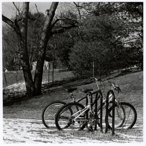
Bike Rack, Winter

Bike Rack, Winter

Square format images just do it for me. I can’t for sure say why, but they do. Let’s chalk it up to the corrupting influence of the twin lens reflex! “Bike Rack” is a 35mm negative shot in full auto on the Yashica T4 Zoom. No contrast filters were used for the exposure on Kodak Tri-X at box speed. The roll was developed in D76 1:1. Standard fare throughout. This is a straight print, cropped to a square and printed on Adorama’s resin-coated variable contrast glossy paper at grade 1. The negative isn’t overly contrasty, but the subject sure is, calling for the soft grade to capture the tonal range I wanted. My aim was to get just enough detail in the snow to show texture, yet retain detail in all but the darkest shadow areas which I would allow to go to maximum black.

One of my process refinements is applying the understanding of how exposure and contrast affect the result; exposure sets the highlights, contrast sets the shadows. I’ve found that increasing contrast does also lighten the highlights, but it may just be that my correction factors for the old Kodak Polycontrast filters are a bit off and I’m underexposing a tad at some grades; I’ll fine tune that as I go along, no doubt. Anyway, this means my first test strip will always be built around finding the right exposure for highlights at the softest grade I have available, as per St Ansel of Carmel’s recommendation in The Print. For this image, I ran a strip along the bottom of the frame and made a roughly half-stops series, centered around a reasonable starting point (the exposure time I used for my previous print on the same paper). This got me pretty much on the money first time. Yay!

My next move was to run a contrast test. For this print, I used the tree on the left as my area of interest. I did a sort of “contrast step wedge” which turned out to be a messy and error-prone approach, one which I quickly abandoned. But it got me where I needed to be again.

This is the first (and to date, only) work print from this negative. It seems that it does well as a straight print, but of course I’m also just happy that I managed to get the result I wanted with only a small number of tests, after my first printing attempts which took several full-size prints to finally get to where I wanted it.

As a result of this darkroom session, I’ve changed how I do initial tests. First, my contact sheets are going to be grade 2, with the negatives removed from the PrintFile sleeves they normally reside in. I just wasn’t happy with how they contact printed while in the sleeves and it’s not as if I’ll be having to make contact sheets more than once per roll anyway, so unsleeving them is no biggie.

Secondly, instead of just pre-cutting a bunch of standard size strips, I’ll start with a sheet of 8×10 of the same type my final print will be made on and figure the entire sheet will be used for testing the one negative. My first strip is purely aimed at highlights and each photograph is different, so a one-size fits all approach is not the way forward. A second strip may be needed to fine-tune, based around the same part of the image.

With basic exposure established, I can decide contrast. It’ll be clear from the contact sheet whether a soft or harder grade is called for. Several generous strips will be exposed in the same region of the image, bracketing around what I think will be the correct grade of filter to use.

Together, those will set the parameters for a straight 7×7 print on 8×10 paper. I’ll pin that up somewhere and see how I feel about it. Maybe, like “Bike Rack”, I’ll get lucky and be happy with that first print. Maybe it’ll need more work.

I’m also starting to think about tools needed for manipulating exposure. More to follow on that.

First Prints!

A few nights ago I finally made my first printing attempts. By all accounts it went well for a first try.

I chose one of my favorite negatives, a shot of some thistles made on 35mm Ilford Pan-F Plus and developed in Rodinal 1+50. It looked like it should print straight without needing dodging or burning and is a good sharp negative on fine grain film with interesting fine detail.

My first step was to make a test strip. Since I had absolutely no clue what would be a good starting point, I went with exposures of 1, 2, 4, 8 and 16 seconds at grade 2.5 and f/8 on the lens. This got me in the ballpark, but with an incredibly short exposure, under 3 seconds. I want to stick around f/5.6-f/11 with this lens whenever it’s practical to do so. Beyond f/11 I can see the grain become visibly less sharp due to diffraction!

Now, 3 seconds is OK if I just want a straight print. But it would be difficult to effectively dodge or burn if necessary, so I wanted to see how I would fare with an ND filter under the lens.

Turns out it works well. My regular 52mm 3-stop ND sits nicely below the contrast filters in the Beseler’s under-lens holder. A new test strip in whole stops, then another in half stops, suggested a time. I exposed and developed the full frame, only to find that it was rather underexposed. So I gave it another stop of exposure on the second try. Much better, but too high contrast. My shadows were about right but highlight detail was missing.

First and second attempts.

Now, I know enough to be aware that, to gain highlight detail, I need more exposure. But then I have to reduce contrast so as to avoid blocking up the shadows.

The next night, I returned to my darkroom, this time with a plan to use the softest grade available to me (grade 1 on my old Kodak Polycontrast filter set) and give a little extra exposure time (minus the 3 stop ND, which I decided to not bother with since I’d not be attempting any manipulations during printing). I figured an extra stop exposure, and ran a test strip which showed me I wasn’t far off. About an extra half stop, in reality.

At the last moment I hedged my bet and went halfway between what the test strip told me and what I had originally guessed. 3.5 seconds, f/8, grade 1.

00127-32-g1f8t3p5s

This is a straight scan from the print, with the black point adjusted to match visually what the print looks like (the white point was fine straight out of Vuescan). Screen and print are quite close in this rendition. I should have gone with what the test strip tried to tell me though, I think this is just a tad too dark overall. Still very happy with it and the highlight area at the head of the main thistle which was flat white in my first attempts has really livened up with the lower contrast and extra exposure revealing detail. Some of the brightly lit leaves and thorns still lack detail, but in looking at the older scan from the negative, I don’t think there’s any detail in the negative to begin with. Turns out it’s a lot higher contrast than I thought…it may even want a small amount of burning in the bright area of the thistle’s head.

So what have I learned from these first print sessions?

  • I second guessed my test strips and came up wrong. Part of the problem is that I rough cut some test strips and made them too narrow, so it’s hard to properly interpret the result. My full size print test strips moving forward will be 4 from a sheet of 8×10, 2.5×8 inches each. Plenty to cover a good sample of an image destined for 8×10, but still reasonably economical. For test stripping my contact sheets I’ll use 1″ wide strips since I’m mostly interested in getting the film rebate to maximum black.
  • Also part of the problem was I jumped straight to the print without bothering to make a contact sheet first (since I already had my digitally scanned contact “sheet” as a basis). A proper contact sheet is a must; scanning and enlarging a negative give quite different results. From now on, any negative I enlarge I’ll first make a contact sheet of that roll if I don’t already have one.
  • My solutions to negative pop and focus shift seem to work well. I’ll detail them in another post.
  • My second night’s print session I brought in a pail of fresh water. This gave me somewhere to rinse chemicals off my fingers (even though I’m using rubber gloves right now), and a convenient supply of water to clean up drips and small splashes while working and give a quick first rinse to my trays immediately after returning the chemicals to their respective bottles.
  • Disposable rubber gloves are a pain.
  • My handy home made test strip guide with exposure guidelines written on it was a great idea. It’s a rough-guide-math-in-my-head approach to cumulative exposure in whole and approximate half f-stops. I think it warrants a post of its own also.
  • I can convert to darkroom use, set up, run test strips, make a work print, clean up and revert to office use in just about an hour. If I don’t have a good hour to work with, I need to leave printing until another time.
  • Washing in a tray in the bath is kind of a pain. I’m looking at building a DIY vertical washer using a plastic file container.
  • A foot pedal for my timer wouldn’t hurt.
  • The metronome approach to process timing works well.
  • Darkroom work is potentially addictive! The satisfaction gained from making a print I’m pleased by is orders of magnitude greater than that gained from making a perfectly post-processed digital file from a film scan.

Speaking of that, here’s a side-by-side of my print scan and the previous film scan I’d done.

A little piece of Scotland beneath the Blue Ridge Parkway    00127-32-g1f8t3p5s

Film scan on the left, print scan on the right.

Darkroom part 1: Pre-requisites

I’ve finally decided to take the next logical (is there anything logical about this?!) step in the pursuit of black and white film photography and start doing wet process contacts and prints. This is, of course, happening on a budget, so I’m trying to do it all as inexpensively as possible, lest it take 6 months to get to where I can make a print.

What are the bare minimums needed to do this? I’ll address some of these in separate posts later, but for now, The List:

  1. A darkroom. My office/den room is the choice here. Yes, blacking out our bathroom would be easy (I already load film into developing tanks there using just a bedsheet to cover the door) but it’s a cramped temporary space and the only bathroom we have. No problem for the 2 minutes needed to load film. Big problem for printing.
  2. Safelight. I’ve seen a 635nm standard-E26-fitting red LED bulb on SuperBrightLEDs.com which is supposedly quite safe for VC papers and is cheaper than the hordes of old school safelights on the ‘bay.
  3. An enlarger. I barely missed a Bogen 22A Special in Goodwill a few months ago, but as Kelli pointed out, “perhaps something else is meant to come along”. She was right of course and I was able to find a Beseler 23C-II via Ebay. The Bogen, while compact and lightweight, would have limited me to 6x6cm medium format (assuming a holder could even be found for that); I have one camera already that does 6x9cm on 120 film. The 23C-II will enlarge from 6×9 and make prints larger than anything I plan to make from all the formats I shoot or plan to. It’s exactly the right amount of enlarger for my needs.
  4. Lenses and holders for the formats I need to enlarge. I have the 50mm I need for 35mm printing, and can find others easily. Holders are also readily available (another reason to opt for the 23C series) and at a pinch can be fabricated using stiff black matboard and gaffers tape for this enlarger.
  5. Timer for the enlarger. I’ll probably try to pick a very basic one up cheaply to get started, but I’m looking at building a custom f-stop timer using an Arduino, which won’t cost much more than the cheapest available timers on Ebay and will be nearly infinitely expandable to fit my specific needs. I can write software and wield a soldering iron, I don’t need to spend more on a used GraLab 300 than I’d spend on making a truly flexible timer.
  6. Grain focuser. I’m quite sure my 10x loupe isn’t the tool for this job. But I’ll make do for now while I’m just practicing.
  7. Multigrade Filters. Ilford is pretty much the only game in town here. The Beseler needs either 6×6 size for the lamphead filter drawer, or under-the-lens types. The 6×6 filters aren’t too expensive brand new, and are my preferred choice. I can get started without these if I need to.
  8. Paper, chemicals and storage. I’ll start cheap and simple (8×10 variable contrast RC paper) while I get a handle on this. Dektol for the developer. I have all the other chemicals I need already.
  9. Trays. I figure a set of 3 11×14 sized trays will serve me well here. Not expensive new. My holding/wash tray can be anything big enough to hold the prints and sturdy enough to carry to the bathroom with water in it. Bigger can wait for a while.
  10. Contact printing setup, for contact sheets. This is easy, I’ll stick a sheet of paper on the enlarger baseboard, put the sleeved negs on top, put a piece of glass from a cheap 11×14 frame on top of that, weight down the edges, and have at it.
  11. Easel. I can initially get away without, or make a mask using matboard cut to the sizes I need. Eventually I’ll want suitable sized easels though.
  12. Dodge and burn tools. I have all I need to make these already.
  13. Spotting ink and brushes. A must have for later, but for getting started I can survive without.
  14. Patience. Lots of it. I don’t expect to make fine prints within an hour of setting this all up. I’m learning a craft and that takes time. My initial “fine prints” may well be scanned from work prints, worked up digitally and sent for print.

More to follow on some of these.

Interpretations of a Negative

“The negative is comparable to the composer’s score and the print to its performance. Each performance differs in subtle ways.” – Ansel Adams.

I feel that this is something we are missing out on with digital and hybrid film-digital means of print. Yes, we’ve gained convenience; I can scan a negative, dust spot it, crop it, remove any distracting elements, set contrast and tonal range, save it out as a high-res file and make any number of copies, all exactly alike. Very handy.

But it’s that “all exactly alike” thing that bothers me. I feel less like someone engaging in a feat of craftsmanship and more like someone feeding parameters into a mass-production machine. Each performance is identical, like listening to a recording on CD rather than seeing the music performed live. The experience is still enjoyable, but the viewer, or listener, is at least one step removed from the humanity of the artist.

Worse, perhaps, is that once the final file is made, I’m unlikely to revisit it again later. It’s set in stone, figuratively speaking. And yet, my own aesthetic isn’t necessarily fixed, a phenomenon I just experienced first-hand.

Kelli and I recently shared a table with a friend at the Saturday morning Vinton (Virginia) Farmers’ Market; I brought some framed photos I had already available, Kelli brought her cards and crafts and a friend sold handmade candy and jewelry. It was enough of a success with Kelli’s cards that we plan to be somewhat regular attendees and while I don’t anticipate making lots of print sales, it’s an additional venue for my artistic efforts. Getting ready to prepare some new prints I had occasion to re-scan and re-process a negative I exposed and first published online late in 2011. I don’t have full-size scans of many of my earlier photos, as I was low on hard drive space and figured I could just make final scans as I needed to later.

Curiosity got the better of me and I compared my June 2013 rendering of “Shadow Walkers” with the December 2011 version on Flickr.

Shadow Walkers        Shadow Walkers

On the left, the old version, on the right, the new rendition (click the thumbnails for larger versions). The most obvious difference is the tonality; the new version has more contrast, with shadow areas dropping into solid black and specular highlights on the roof supports being brighter. Somewhere in the last 18 months I’ve realized that fear of blocked shadows is irrational; if the image demands dark shadows, then full speed ahead and never mind the histogram! I also figured the overhead lights could blow out to white without detracting from the image; they are, after all, very bright spots in real life. The moody intent remains intact, and maybe even enhanced by the contrast boost.

Other changes are more subtle. The newer version has a small amount of perspective correction to make the verticals truly vertical, though the overall crop is about the same. Also, a distracting bright light of some sort below the left-side handrail in the old version has been cloned out in the newer one. A small local contrast boost has been applied and there are probably some differences in the sharpening.

With a handmade silver gelatin print, there would be small differences in every print. Every one would be a hand-crafted individual item, subtly different to its siblings. As my artistic expression evolves, so will the exact rendering of this image. The art buyer gets something which was created, in effect, just for them; not last year’s artistic expression churned out onto paper by the push of a button. Going back to Ansel Adams, his prints of the same negative would change over the course of his career. It seems fitting to give him the final word here:

“The more recent prints are less timid. The early ones are softer, some think more subtle. I have a sharply different vision now. The results are, perhaps, more dramatic. It’s a growth in vision or–who knows?–maybe a regression. [Chuckles] Anyway, it is different, just as a concert artist performs the same piece differently over the years. Quite a number of years ago, I heard the New York Chamber Music Society orchestra play a Haydn piano concerto with Rudolf Serkin as soloist. The last movement was particularly marvelous, and everyone was ecstatic. The entire orchestra was called back and the last movement was repeated. Serkin played it differently; he added a little magic to his interpretation, and the audience went bonkers. The orchestra came back for a second encore, and Serkin played the last movement again. And he gave it another twist. The rhythm was the same, the notes, the phrasing–just certain subtleties, a little emphasis here and there. Three subtle variations in one evening! It was wonderful. Such variations are the artist’s privilege. If my newer prints appear more bold and dramatic, it is because I became more confident and I was better at getting what I wanted.” – Ansel Adams, interviewed for the March 1983 issue of Playboy Magazine.

The full interview can be found on David Sheff‘s website and is an excellent read.

Becoming ruthless at self-editing

So, today’s topic is editing, and I’m not talking about making changes in Photoshop. I’m talking about deciding what gets to be seen by anyone else and what languishes in the binders.

Sad to say, not every photograph I make is worth the silver in the negative. Some of them aren’t even worth the gelatin the silver is suspended in. Some of them were never intended to have any higher purpose than being a snapshot, something with value to me and my loved ones but of no consequence to anyone else. The world at large doesn’t need to see the 500th photo of my cat, or 400th photo of my granddaughter unless I knocked it out of the park and made something which can touch the viewer’s emotions even when they don’t know the subject.

Not quite a select

A not-quite-select. I like the composition with the leading lines and I like the tones I got from the negative. But in a ruthless editing environment, those parked cars in the background were the difference between a thumbs-up and thumbs-down. It's a tough life, being a photograph.

Shooting film may make me think a bit more about whether I need to bother opening the shutter at all but I’m not perfect. If I was, I’d be deciding which work to exhibit at the American Museum of Photography while fending off requests from Joe McNally and David Hobby to teach them everything I know about lighting. Speaking of pros, just ask one how many shots they make versus how many the public or their clients get to see.

It’s easy to slip into the thinking that “well, if I just tweaked it a bit this way, and adjusted that there, and did some other stuff, this might be a worthy photo”. I’ve spent more than a little time doing the Photoshop equivalent of polishing a turd. 9 times out of 10 I turned a bad photo into a bad photo with obvious, cheesy post-processing and several hours of my time sunk into it just to add salt to the wound.

It’s also easy in the modern, everything online world to slip into thinking that it’s OK to post everything you ever produce because it’s so easy to do, and costs nothing. But that’s not what I want to do either. Just because I can post a photograph to Flickr doesn’t mean I should. I’m rapidly coming around to the idea that, if it isn’t worth printing and showing to people, it’s not worth sharing online. I don’t want my moments of inspiration to be lost in a sea of near-misses.

Which leads to the ruthless editing part. If something is print-worthy that implies that I will take the time and materials to print and present it. Not being of limitless resource I can’t print everything which I like, so guess what? I have to edit down to a small core of work. This is not an easy process because I’m editing from a selection of work I really like and the photographs which don’t make the cut may never be seen beyond the confines of my computer/light box/contact sheets. The end result, of course, will be a concentrated selection of what I consider to be my best work. Something dangerously close to being a portfolio, even.

So it’s hard, yes. But it’s necessary for all sorts of reasons, and while my ruthlessness may currently be limited to selecting no more than 6 frames from 36 exposures (or 3 from 12 on medium format) I probably need to be working that down even further. It’s way better than posting 3/4 of the shots on a roll, though, like I used to.