Category Archives: Scanning

Why color print film rocks (sometimes)

I don’t do a whole lot of color shooting, in fact most of what I do in that regard is strictly of the family snapshot variety and occasionally grabbing a shot of something which just suits color better.

In truth, this is the sort of shooting which would be ideally suited to digital but right now I generally use the family SLR (a Minolta Maxxum 5000AF) for it. It’s a lightweight, auto focus, auto exposure, motor driven camera. With a 35-70, 100-200 and a “nifty fifty”, plus both the small flash unit (1800AF) and the recent addition of the big gun of the lineup (4000AF) offering TTL flash exposure it has the bases well covered for that type of shooting.

This lets me keep the Canon F-1 loaded with black and white film, without having to swap around rolls.

The last roll of color film I shot was Fuji Superia Xtra 400, available in all kinds of places. It looks great scanned and should print to huge sizes without much problem.

The thing I like most of all about this film, though (and color neg in general), is the exposure latitude. That last roll had a great many bounce flash shots which were underexposed by 1-1/2 to 2-1/2 stops (Sunpak auto-thyristor flash on Canon F-1 for this roll, not the TTL-equipped Minolta rig). Any number of things could have caused this, but the point is that I was able to get good images even then.

My scanning is standardized for color work. I have preset Vuescan configurations with film base color, exposure etc. locked in so that a well-exposed negative of a sunlit (or electronic flash-lit) scene will render well-exposed and properly color balanced. I scan as 16-bit TIFF to allow plenty of wiggle room for exposure and white balance adjustments.

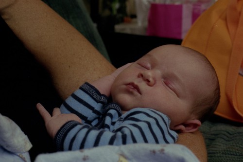
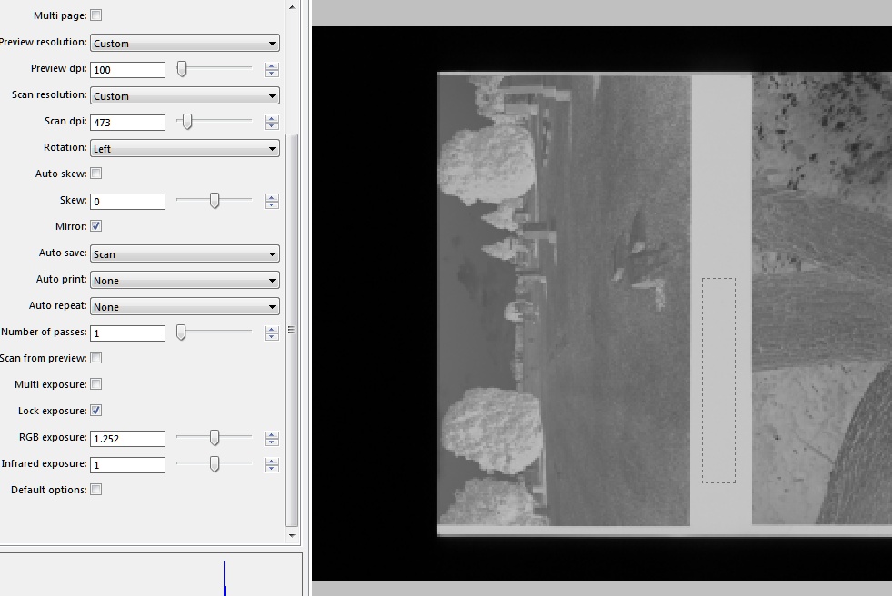
And wiggle, I can! Take a look at this example, as scanned. Hah, fooled you, auto thyristor flash!

Bennett 1 week old

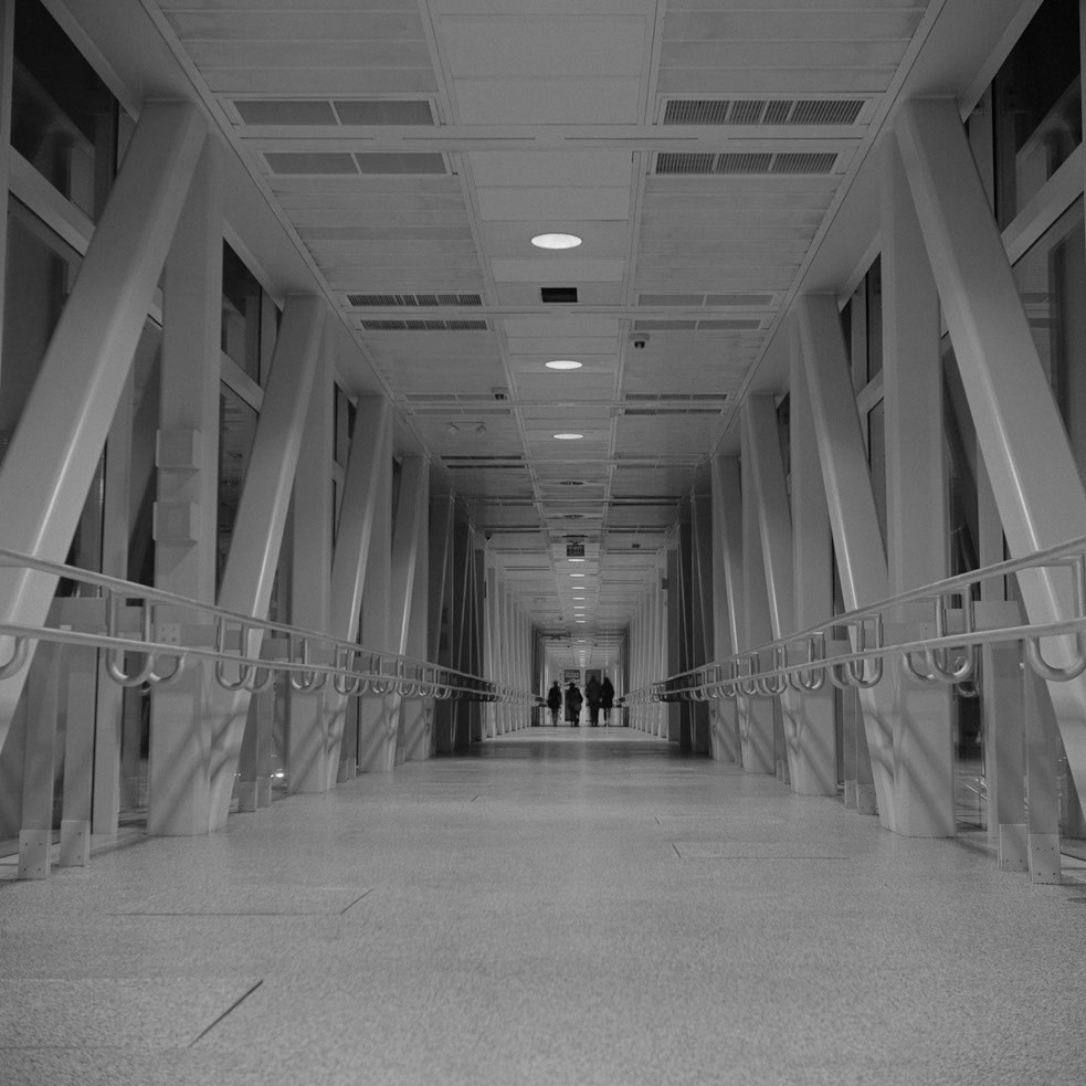
About a stop and a half underdone, as demonstrated by pushing the ACR exposure slider on the TIFF by about that much, leading to this:

Bennett 1 week old

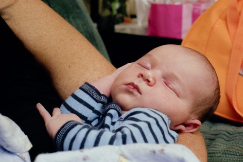
Yeah, that’ll work. Colors remain where I want them, grain is good too (even on 100% zoom on the original scan). But how far can I push it, how much detail is there hidden away in those dark corners? Let’s goose the exposure all the way over, turn the contrast curve up to 11 and see what emerges out of the shadows!

Bennett 1 week old

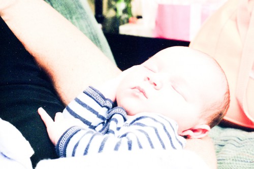
Wow, tonal detail in that dark area in bottom left. And green speckly scanner noise. I don’t recommend this. But there is some tonal information hiding in there if you want it.

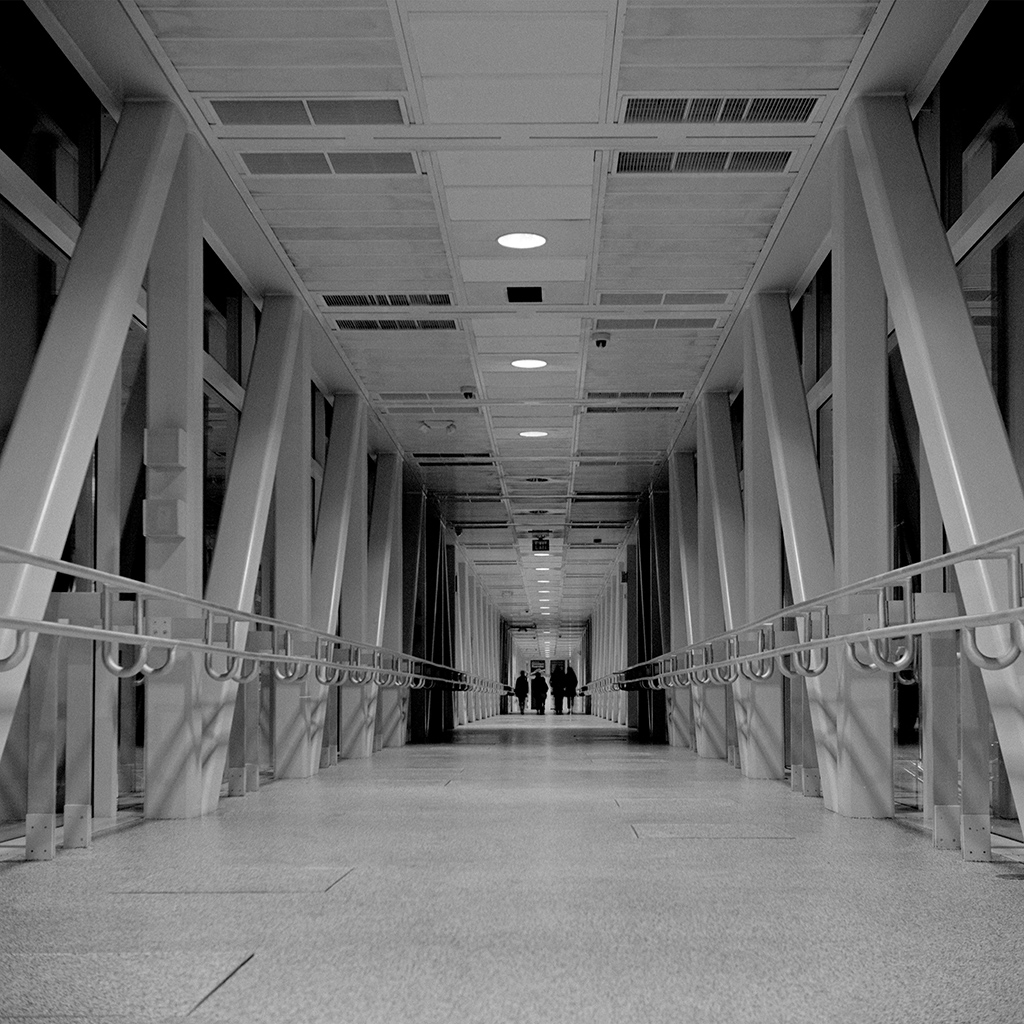
But wait, there’s more! What if I tackle this specific frame with scanning settings tailored toward an underexposed negative?

latitude-test_4

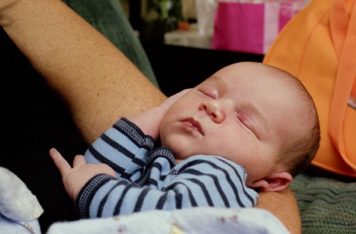
Honestly? I don’t see much difference in any way that matters. Either way, I get a very usable result! Yes, cranking the exposure up reveals less scanner noise in the dark areas, but it’s not like I was going digging for detail in those anyway.

Exploring film base consistency

Err, what?

When making contact sheets, you want to keep things consistent. Film base exposes to just shy of black on the paper and highlights fall wherever they will at grade 2. That informs you whether you blocked up shadows or not, and what might be a reasonable contrast grade to use for a fine print.

Yes, but…what?

The film base (or more accurately, base plus fog) represents the absolute lightest shade on the film. No exposed part of the film can be lighter, and consequently no part of the print can be darker than the film base.

So film base plus fog is important in making contact sheets. I really, really don’t want to have to run a test strip every time I make a contact sheet. This is not the “fun” part of darkroom work any more than making digital contact sheets was fun. It’s a necessary step, that’s all, and having to run a test strip every time just makes it even less fun (I have nothing against test strips, I enjoy that part of the printing decision-making process, picking my area of interest and wrestling the tones into place. It’s a challenge, unique to every negative and paper combination. Contact sheet test strips, on the other hand, are not a challenge. Expose expose expose expose develop which strip is most black? No artistic interpretation required. At all.)

Anyway, my point: if I can keep things as consistent as possible where the film is concerned, I can keep my contact sheets consistent without having to test constantly to find the right time. One exposure to rule them all, and in the darkroom, bind them.

I love both Tri-X and Ilford HP5+. Visually, it has always seemed that while my HP5+ has very consistent base tone, my Tri-X can get a bit…variable. My process isn’t that wobbly. Really. Now I don’t have a fancy densitometer, but I do have a film scanner and Vuescan (which has an exposure lock feature intended to set exposure off the film base).

Ghetto Densitometer

Using VueScan to measure base+fog on a strip of film. Note the selection area and the “RGB Exposure” lock settings on the left side. All 5 rolls of HP5+ were within a couple of hundredths of this one. Tri-X varied more but not enough to warrant testing every time.

So I used what I had, like the resourceful little maker I am.

I found that the 5 rolls of HP5+ I tested were incredibly similar. This is despite their being developed at various temperatures in the 70-74F region, with times I was still trying to decide on. They were all fixed in Kodak Hardening fixer (not recommended BTW with HP5+ unless you enjoy reverse cupping, I guess Ilford recommend non-hardening fix for a reason!)

The Tri-X, by comparison, had much more variation, though still within a narrow enough range that I’d be OK using the same exposure time.

Interpretations of a Negative

“The negative is comparable to the composer’s score and the print to its performance. Each performance differs in subtle ways.” – Ansel Adams.

I feel that this is something we are missing out on with digital and hybrid film-digital means of print. Yes, we’ve gained convenience; I can scan a negative, dust spot it, crop it, remove any distracting elements, set contrast and tonal range, save it out as a high-res file and make any number of copies, all exactly alike. Very handy.

But it’s that “all exactly alike” thing that bothers me. I feel less like someone engaging in a feat of craftsmanship and more like someone feeding parameters into a mass-production machine. Each performance is identical, like listening to a recording on CD rather than seeing the music performed live. The experience is still enjoyable, but the viewer, or listener, is at least one step removed from the humanity of the artist.

Worse, perhaps, is that once the final file is made, I’m unlikely to revisit it again later. It’s set in stone, figuratively speaking. And yet, my own aesthetic isn’t necessarily fixed, a phenomenon I just experienced first-hand.

Kelli and I recently shared a table with a friend at the Saturday morning Vinton (Virginia) Farmers’ Market; I brought some framed photos I had already available, Kelli brought her cards and crafts and a friend sold handmade candy and jewelry. It was enough of a success with Kelli’s cards that we plan to be somewhat regular attendees and while I don’t anticipate making lots of print sales, it’s an additional venue for my artistic efforts. Getting ready to prepare some new prints I had occasion to re-scan and re-process a negative I exposed and first published online late in 2011. I don’t have full-size scans of many of my earlier photos, as I was low on hard drive space and figured I could just make final scans as I needed to later.

Curiosity got the better of me and I compared my June 2013 rendering of “Shadow Walkers” with the December 2011 version on Flickr.

Shadow Walkers        Shadow Walkers

On the left, the old version, on the right, the new rendition (click the thumbnails for larger versions). The most obvious difference is the tonality; the new version has more contrast, with shadow areas dropping into solid black and specular highlights on the roof supports being brighter. Somewhere in the last 18 months I’ve realized that fear of blocked shadows is irrational; if the image demands dark shadows, then full speed ahead and never mind the histogram! I also figured the overhead lights could blow out to white without detracting from the image; they are, after all, very bright spots in real life. The moody intent remains intact, and maybe even enhanced by the contrast boost.

Other changes are more subtle. The newer version has a small amount of perspective correction to make the verticals truly vertical, though the overall crop is about the same. Also, a distracting bright light of some sort below the left-side handrail in the old version has been cloned out in the newer one. A small local contrast boost has been applied and there are probably some differences in the sharpening.

With a handmade silver gelatin print, there would be small differences in every print. Every one would be a hand-crafted individual item, subtly different to its siblings. As my artistic expression evolves, so will the exact rendering of this image. The art buyer gets something which was created, in effect, just for them; not last year’s artistic expression churned out onto paper by the push of a button. Going back to Ansel Adams, his prints of the same negative would change over the course of his career. It seems fitting to give him the final word here:

“The more recent prints are less timid. The early ones are softer, some think more subtle. I have a sharply different vision now. The results are, perhaps, more dramatic. It’s a growth in vision or–who knows?–maybe a regression. [Chuckles] Anyway, it is different, just as a concert artist performs the same piece differently over the years. Quite a number of years ago, I heard the New York Chamber Music Society orchestra play a Haydn piano concerto with Rudolf Serkin as soloist. The last movement was particularly marvelous, and everyone was ecstatic. The entire orchestra was called back and the last movement was repeated. Serkin played it differently; he added a little magic to his interpretation, and the audience went bonkers. The orchestra came back for a second encore, and Serkin played the last movement again. And he gave it another twist. The rhythm was the same, the notes, the phrasing–just certain subtleties, a little emphasis here and there. Three subtle variations in one evening! It was wonderful. Such variations are the artist’s privilege. If my newer prints appear more bold and dramatic, it is because I became more confident and I was better at getting what I wanted.” – Ansel Adams, interviewed for the March 1983 issue of Playboy Magazine.

The full interview can be found on David Sheff‘s website and is an excellent read.

Proof Scanning (the digital contact sheet)

I’m not sure why I didn’t think of this one before. It’s such a time saver.

I cut and sleeve my negatives in the Printfile clear sleeves for storage. One of the useful features of these sleeves is that you can make contact sheets from the negatives without having to remove them from the sleeve.

Not having a darkroom at this time, my workflow involves scanning the negatives on a roll at low resolution in order to get my “contact sheet”, though a better term might be “proof scans”. This is a pretty quick operation and with everything locked to a standard exposure setting I get a good feel for how well I exposed the film.

But fiddling with those Epson film holders is a pain, and slows things down. For my 6×6 negatives it’s even worse because they only fit two frames at a time. I’d started cutting those into 4 strips of 3 and scanning them directly on the glass for my proofs, using a piece of posterboard as a scanning area guide and to keep the strip straight.

This week it occurred to me to try scanning my proofs with the negatives still sleeved. I had 3 rolls of color negatives and didn’t feel like spending an evening farting around with the 35mm holders so I used my posterboard guide, put the filled Printfile sleeve on the scanner glass and set a sheet of glass from an old picture frame on top to keep it all flat. Just like I would if I was making a contact sheet on photo paper.

Worked very nicely and saved a good deal of time. I do have to keep the sleeve material away from the very top area of the scanning bed, since the scanner does something with that area related to exposure and things can get a little weird and unpredictable if I’m not careful to leave it clear. Vuescan coped well, the lock exposure function allowing me to set an exposure time which took the film base and sleeve into account.

They’re not the cleanest scans, of course. The sleeves do have a slight texture and keeping everything clean of dust and specks would be very time consuming. But I’m not after the cleanest scans I can get, I just want to get an idea of how the photos look in their final positive form. A digital contact sheet.

I’ll be taking this approach from now on, at least until I set up to do it the old fashioned, no computer required way.

Ilford HP5+ part 1

My first two rolls of Ilford‘s HP5+ film have been shot and developed.

The film was shot at box speed (400) metered using the ever reliable Gossen Luna Pro F. I developed in Rodinal 1+50 dilution for 11 minutes at 68F. This is the official time recommended by Ilford and also listed in the Massive Dev Chart.

First of all, I’m pretty certain that the development time was too short. Almost all of the negatives came out quite thin. I know my metering was correct, especially so for the incident metered shots which were very consistent in their difference from what I consider normal. I’m reasonably sure that the Yashica’s shutter speeds are in spec, or certainly not out by a stop or more. I haven’t had any trouble with previous rolls of Tri-X, Acros and Ektar run through it. I used all the shutter speeds throughout the roll and counted out some exposures in the 2-4 second range with the shutter set to bulb. Just can’t see all the speeds suddenly being out of whack by the same amount and my counting to be off by the same amount.

Also the edge markings on the film seem to be rather thin-looking.

So next roll I develop I’ll try something else. Possibly 13 minutes with normal agitation (30 seconds at start, 3 inversions every minute).

I also got a reasonable answer on my “which reciprocity adjustments to use” question: the Ilford official adjustments resulted in an overly dense negative, even with everything else on the roll looking thin. The shorter time garnered from testing yielded a negative with tones a lot closer to the other shots on the two rolls. I’m going to stick with those times and throw the datasheet’s recommendations under the bus.

I did notice that the lights in my night shots seem to be very dense despite the underdevelopment. Perhaps this film would respond well to a reduced agitation approach. Perhaps I’m used to Fuji Acros 100’s ridiculous ability to hold onto highlights.

What else? I like what I see so far in terms of detail and grain (supposedly Rodinal and HP5+ are not a match made in heaven, but I’m not seeing any big problem. Then again I’m not pathologically averse to grain either). I’ll be picking up another few rolls of this and refining my development.