It’s been a little while since I last updated on printing progress. I’ve made good work/proof prints from 3 negatives so far, have been refining my process and continuing to gather necessary materials and equipment.
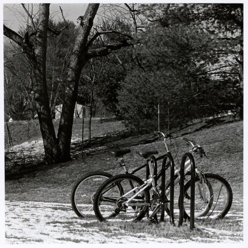
Square format images just do it for me. I can’t for sure say why, but they do. Let’s chalk it up to the corrupting influence of the twin lens reflex! “Bike Rack” is a 35mm negative shot in full auto on the Yashica T4 Zoom. No contrast filters were used for the exposure on Kodak Tri-X at box speed. The roll was developed in D76 1:1. Standard fare throughout. This is a straight print, cropped to a square and printed on Adorama’s resin-coated variable contrast glossy paper at grade 1. The negative isn’t overly contrasty, but the subject sure is, calling for the soft grade to capture the tonal range I wanted. My aim was to get just enough detail in the snow to show texture, yet retain detail in all but the darkest shadow areas which I would allow to go to maximum black.
One of my process refinements is applying the understanding of how exposure and contrast affect the result; exposure sets the highlights, contrast sets the shadows. I’ve found that increasing contrast does also lighten the highlights, but it may just be that my correction factors for the old Kodak Polycontrast filters are a bit off and I’m underexposing a tad at some grades; I’ll fine tune that as I go along, no doubt. Anyway, this means my first test strip will always be built around finding the right exposure for highlights at the softest grade I have available, as per St Ansel of Carmel’s recommendation in The Print. For this image, I ran a strip along the bottom of the frame and made a roughly half-stops series, centered around a reasonable starting point (the exposure time I used for my previous print on the same paper). This got me pretty much on the money first time. Yay!
My next move was to run a contrast test. For this print, I used the tree on the left as my area of interest. I did a sort of “contrast step wedge” which turned out to be a messy and error-prone approach, one which I quickly abandoned. But it got me where I needed to be again.
This is the first (and to date, only) work print from this negative. It seems that it does well as a straight print, but of course I’m also just happy that I managed to get the result I wanted with only a small number of tests, after my first printing attempts which took several full-size prints to finally get to where I wanted it.
As a result of this darkroom session, I’ve changed how I do initial tests. First, my contact sheets are going to be grade 2, with the negatives removed from the PrintFile sleeves they normally reside in. I just wasn’t happy with how they contact printed while in the sleeves and it’s not as if I’ll be having to make contact sheets more than once per roll anyway, so unsleeving them is no biggie.
Secondly, instead of just pre-cutting a bunch of standard size strips, I’ll start with a sheet of 8×10 of the same type my final print will be made on and figure the entire sheet will be used for testing the one negative. My first strip is purely aimed at highlights and each photograph is different, so a one-size fits all approach is not the way forward. A second strip may be needed to fine-tune, based around the same part of the image.
With basic exposure established, I can decide contrast. It’ll be clear from the contact sheet whether a soft or harder grade is called for. Several generous strips will be exposed in the same region of the image, bracketing around what I think will be the correct grade of filter to use.
Together, those will set the parameters for a straight 7×7 print on 8×10 paper. I’ll pin that up somewhere and see how I feel about it. Maybe, like “Bike Rack”, I’ll get lucky and be happy with that first print. Maybe it’ll need more work.
I’m also starting to think about tools needed for manipulating exposure. More to follow on that.
