In which the artist attempts some local manipulation of tonal range for the first time…
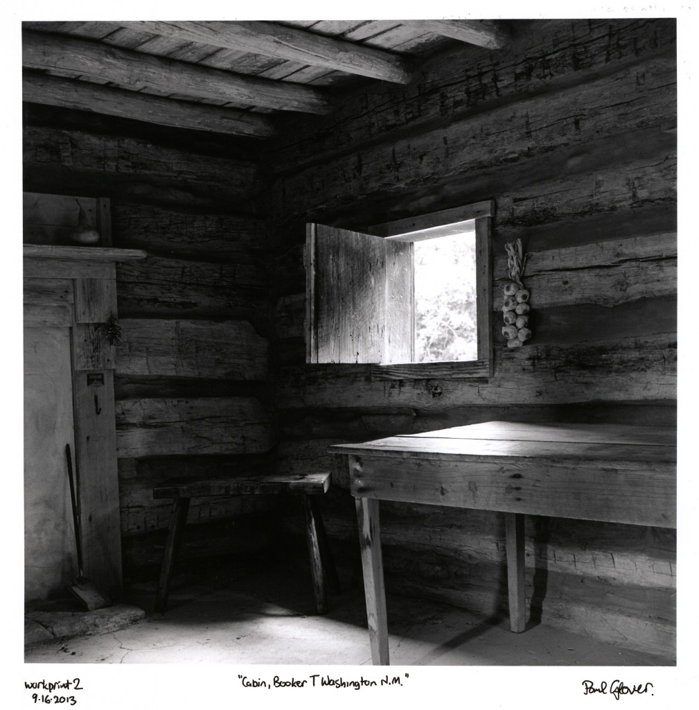
Inside cabin, Booker T Washington National Monument
I made a first work print of this a couple of weeks ago, in large part to test my newly acquired Schneider Componon-S 80/4 lens (a cheap find on Ebay, optically great but with a minor mechanical issue – the aperture click stops don’t work). The Kodak Tri-X negative was exposed at EI200 in my Yashica A. I think I used the B+W 029 deep red filter to try to darken the sunlit greenery outside while lightening the reds-and-browns interior, also the three stops of extra exposure took me out of the Yashica’s shutter speed “dead zone” (that irritating gap between the fastest time I can reliably open the shutter for in bulb mode and the slowest timed speed of 1/25th that the old Copal in the “A” offers; I seem to land in that range rather too often for comfort). The work prints were made on Ilford MGIV resin-coated glossy paper.
For such a contrasty subject, the grade 2 contact sheet looked quite close to what I wanted to see in the final print. Looking at it, I knew my area of highlight interest was the window. I wanted it to show just enough detail to suggest what was out there. But how to do that? The “traditional” test strip across the image would be mostly shadow or mid-tone area in this case. Not at all what I needed.
For focusing and composition, I’ve taken to throwing a sheet of plain old copy paper into the easel (which I painted flat matte black so as to be very sure it never screws with my contrast or exposure, ever). The nice thing about that is I can mark the copy paper up with a soft pencil, so I sketched in the window area I wanted to test, marked the exposure sections along it and extended the guide lines out far enough to go beyond the test strip I’d use. I cut a suitably sized piece from an 8×10 sheet of MGIV and held it in place over the target area with a small magnet, then exposed it in sections using the marked up guide lines just like any other test strip. Because I only had a little area to work from, I exposed in whole stop steps, then ran a second test strip at smaller increments around where the first strip looked best.
The remainder of the 8×10 sheet was cut into generously wide strips exposed at grades 1, 2 and 3, taking in both the window and the darkest shadow areas. Again, I marked up the general area I wanted the strips to cross, so I would be able to position them somewhat accurately. It looked like grade 2 was a little hard, but a fourth strip at 1.5 wasn’t contrasty enough. So grade 2 it was, then.
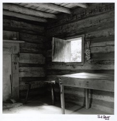
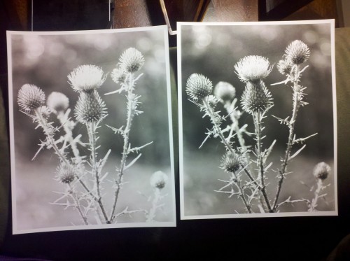
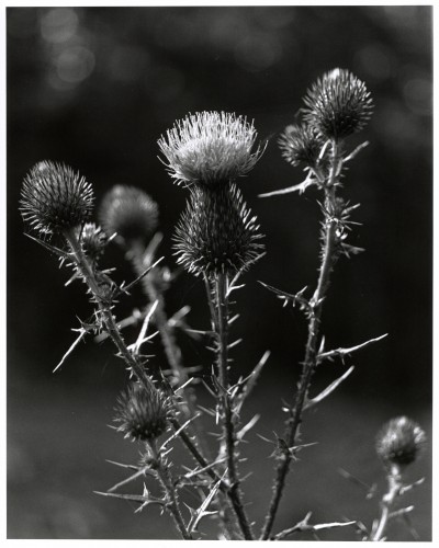
Straight (no manipulations) work print. Note how bright the floor area to bottom left is.
A first work print looked great, but after living with it on my office wall for a day, I realized the brightly lit floor area was distracting. This meant…gulp…I’d have to do what I’d kind of been avoiding so far and try some manipulation; in this case, a slight burning in of the floor area to darken it.
A brief aside: dodging and burning are darkroom techniques in which selective areas of the print are exposed for longer or shorter times to darken or lighten their tone relative to the rest of the print. Their namesakes in the Photoshop tool palette do the exact same thing. On the face of it, the technique is simple enough, but it requires some degree of coordination, good timing and a steady-ish hand.
Having not tried this before, I loaded the negative back into the carrier, framed and focused on the easel as before, then practiced the move I wanted to make. I’d decided about 2 extra seconds would be a good first try, switching to grade 1 for the burn in to minimize the effect on mid and shadow tones. Once I was as ready as I felt I could be, I loaded a sheet of MGIV and made my exposures; my previous base exposure at grade 2 and the burn in at grade 1.
I felt terribly clumsy doing it and expected it to look awful, but it didn’t. The darkening is subtle, but helps reduce the distraction of the floor a little without being unnatural. I’m pretty happy with how it turned out, though I think it might benefit from a slight increase in burn in time.
In this session I also did a bit of pre-planning for larger prints. I have trays and paper on the way for 11×14 printing, and had chosen my 11×14 easel knowing I would want to print larger than 8×10. I’m looking at square format 10×10 as a typical size for my final prints, which doesn’t sound very large but it is substantially larger than the 7×7 work prints I’ve been doing (double the surface area, in fact). Anyway, I raised the enlarger head and refocused until I had the image framed nicely in a 10×10 square. For exposure, I recalled reading that each step up in standard sizes (or doubling of area covered) is a one stop change in exposure. So, 8×10 to 11×14 needs one stop more exposure time, or opening the lens one stop. In my case the increase from 7×7 to 10×10 is about the same in theory. Throwing caution to the wind I opened up the lens from f/11 to f/8 and exposed a whole sheet of 8×10 at the same base time as my 7×7 at f/11.
Result! It is pretty much where I wanted it to be, visually just about indistinguishable from the 7×7 version.
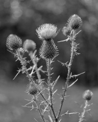
Needless to say I’m all kinds of excited about my 11×14 upgrade (try doing that with your cheap A4/Letter inkjet printer) and will be making a nice 10×10 print of this image just as soon as I can. Of course I can’t actually scan a print that size, but the work print #2 above is the reference print for any subsequent prints I make and so is representative of the final product.