Another way I’ve found square compositions to work with portraiture is in the three-quarters length, where I might want to convey a less-intimate feeling while giving the surroundings some love. A vertical composition would cut much more of the environment out, while switching to a horizontal composition would cause the subject’s surroundings to be emphasized more heavily.
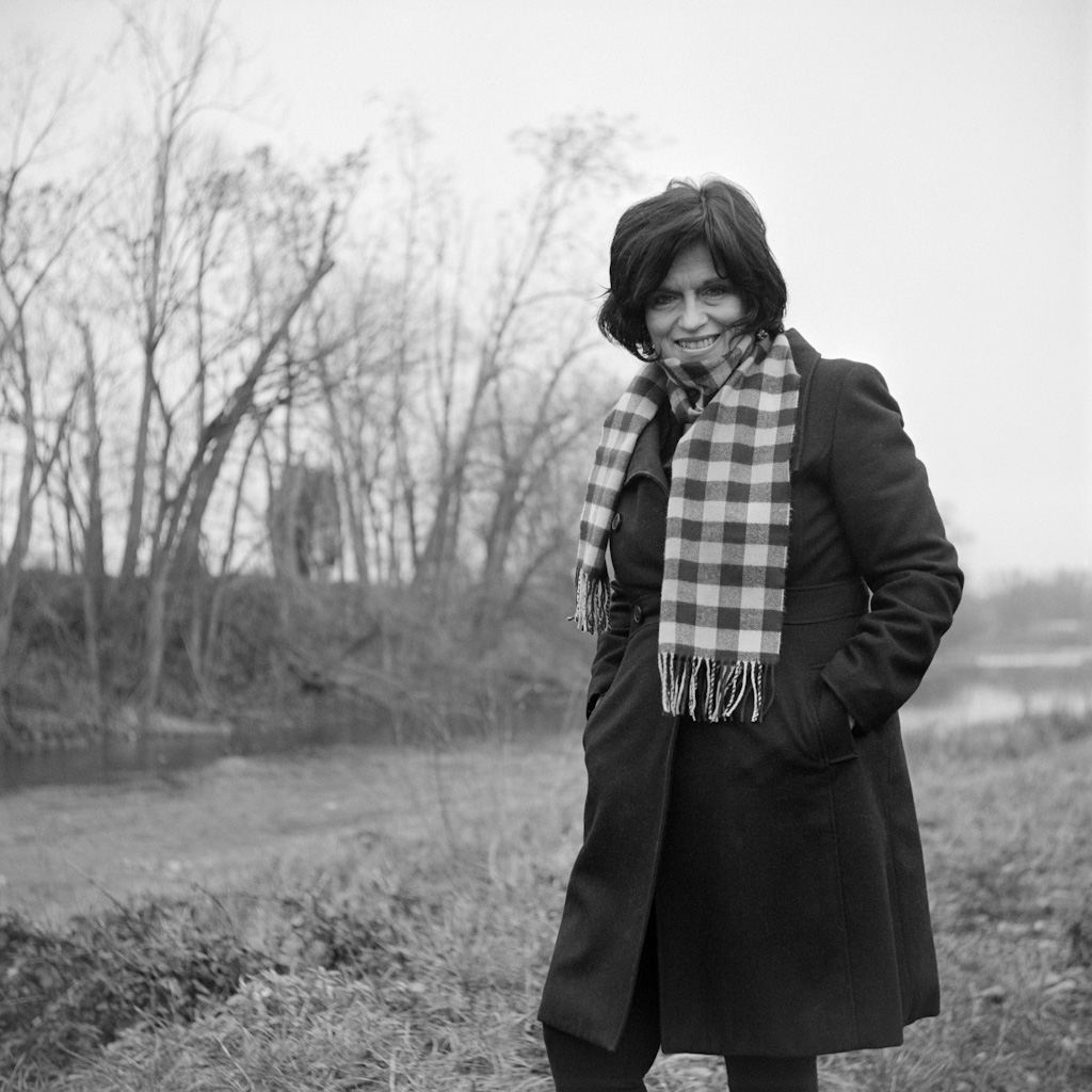
Here, we see a 3/4 length portrait of Kelli in a square composition. There is enough width in the square to be able to show that it’s quite a wintry looking day down by the river; the trees are bare and the sky overcast. Brrr! A vertical crop would have cut much of the surroundings out, which in this case I wanted to keep. A horizontal composition would have given the surroundings too much emphasis, or would have forced me to change to a closer-up portrait, which wasn’t my intent here. The square gave me a perfect balance. Putting Kelli slightly right of the frame helped balance the treeline. Alternatively, I could have moved to my right, filled the background evenly with trees, and positioned my subject dead center for a more symmetrical composition, which also works well in a square.