Category Archives: Printing

The darkroom lives! New fiber-base papers from Ilford Photo.

If there’s one company I have no doubt at all stands behind film photography, it’s Ilford Photo. The UK-based outfit is far and away the leader in traditional black and white photography, with a full product lineup of film, paper and chemistry which puts everyone else to shame. Not bad form at all considering that just about a decade ago their future seemed very much in doubt.

These days they’re in rude health, described as “robustly profitable”, launching new products like the “Titan” large format pinhole camera and operating black and white pro lab services in both the UK/Europe and USA/Canada markets. Today’s announcement, however, is of major significance to people like me who still operate their own darkroom; an update to one fiber-based paper product and a whole new FB paper line!

The Ilford Multigrade FB lineup - classic, warmtone and new cooltone.The existing MGIV fiber base product is being replaced by a new, improved version called Multigrade FB Classic with shorter exposure times and better responsiveness to toning compared to the MGIV FB papers it replaces. An all new cool tone paper, Multigrade FB Cooltone, is being added to the lineup. Meanwhile, the existing Multigrade FB Warmtone will remain unchanged. Ilford Photo now have a complete fiber-base paper lineup which affords a great deal of control over the final image through choice of paper and toning options. Fantastic!

Now, granted, I have not yet dipped my toe into printing on fiber base paper. I have a sample pack of Adorama’s matte and glossy FB papers I bought when I first opened up my darkroom, but concerns over the hardening fixer I was using being difficult to wash out and not having a proper print washer or hypo eliminator had caused me to hold off. Plus I really wanted to make sure I had the basics down on cheaper RC materials before jumping in at the deep end of proper fine art papers and the extra processing diligence they call for. Since I’ve switched to a non-hardening rapid fix again, specifically Formulary TF-5 which is said to make washing FB paper much easier even without the use of hypo eliminator, I intend to work through that sample pack soon to get a feel for working with fiber base materials.

Anyway this is great news for those of us who love the dark(room) arts and want to see the craft of traditional printing live on. Clearly, Ilford Photo believes it’s worth the R&D effort to make whole new products for us.

Follow @Ilfordphoto on Twitter.
Spotting Prints Using Diluted India Ink

In a previous installment of “Paul vs The Negative”, our protagonist emerged victorious from the darkroom, clutching 3 decent-quality final prints made from a badly exposed Kodak BW400CN negative.

There is a problem with those prints, a problem which I’ve been fortunate to have avoided so far, despite my darkroom also doing duty as kitty toilet (yay, fine clay dust and cat hairs everywhere all the time!) The prints have a lot of very obvious places which need spotting. To complicate matters, this print is on resin coated pearl finish paper, fixed in a hardening fixer. Apparently, I really like a challenge…

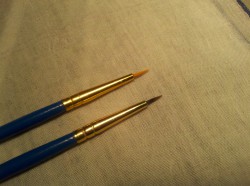
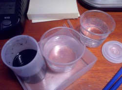
Ink and clean waterFor this first go at spotting, I opted to attempt cleanup on the first work print I’d made using existing supplies: bottled black India ink and a cheap 10/0 spotting brush. This is not an approach I’ve been able to find much information about online, just about any reference to print spotting with India ink was about how to use the dry India/China ink sticks plus gum arabic, just like Weston used to.

Straight India ink from the bottle wouldn’t work; I’d played around with that already and found that it forms a very obvious raised matte patch. Tonal control is also next to impossible.

So instead I made a whole series of different dilutions to get a range of grays, which after some experimentation turned out not to be entirely necessary, at least this first try.

BrushesWhat I settled on as I worked the test print, and which I used for my first final print, was having a 1:30-ish dilution of ink into distilled water. This proved to offer a good degree of tonal control. Pick up a brushful of the dilute ink and it’s very dark, but blot it out on paper and the tone lightens up quickly. By careful blotting, I can fine tune very quickly to get a tone which will work for the spot I want to hide.

I also found I could, with some care, undo a botched spot by using a clean brush with plain water to re-soak the spot, then very carefully picking up the water with a dry brush, taking the ink with it. Best of all, the India ink is acid-free, archival and light fast, so it’s going to stick around and not cause any problems. Using distilled water should help too.

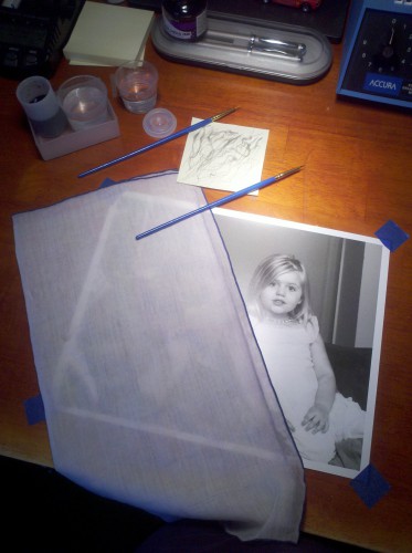
Holding and protecting the print during spotting.

At normal viewing distance and angle, I can’t tell the light and midtone areas have been spotted at all, and I know where the bodies are buried. Only the darkest spots are relatively easy to find, and again that’s not something which I anticipate will cause problems under normal conditions.

I may adjust this as I go along. I can see maybe having a range of dilutions for different tonal areas. 1:30 seemed a good overall compromise, but I found it necessary to make several passes over the really dark spots with this dilution and the really light areas proved tricky because the brush was just about dry by the time I’d blotted it out to the right tone. As I refine this I’ll play around some with making differing tones to see if that works better.

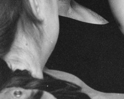
Before spotting  After spotting

Before and after: these were the worst of the white spots on the print. I’m reasonably happy with how this turned out for having no experience of spotting a print before. If you look at the full-size versions you’ll see the spotting is by no means perfect. Fortunately it doesn’t have to be; it only has to stand up to scrutiny under normal viewing, not magnified to where the full print would be almost 4 feet across, which is roughly what the full-size scan of this section amounts to. Those thumbnails, by contrast, aren’t far from actual size on my display.

I think I’ve found my print spotting technique and best of all it uses materials I bought locally (not so easy in a mid-size second-tier market)! It’s not any cheaper than purpose-made spotting dyes, but I can’t buy those locally at half a dozen different places. I’ll have to try it on some glossy-finish prints next, those are said to be notoriously difficult to spot.

An unintentional longevity test

I didn’t really set out to test for print longevity under less than ideal processing conditions. But when I was working on the BW400CN final prints, I tested a minor tweak in the exposure by running a test print using a partial sheet of 8×10. I did this because I wanted to see the impact of the exposure change across the most important area of the entire print, and because once I was done making the prints I wanted to make, the partial sheet would have been the only piece of Adorama VC RC Pearl paper I had left. So I figured I might as well use it since I don’t have any plans to buy more of it in the pearl finish.

I should point out that I quite like the Adorama paper, but I think my preference is for glossy finish rather than pearl, and after handling a print made on Ilford fiber-base glossy paper, I’m sold on using that type of paper for my good prints (just need to build a simple print washer so I can properly process the stuff without having to supervise a tray siphon rig for nearly an hour). On the other hand, their glossy RC paper is great for contact prints, and incredibly good value.

Anyway…the test print I made is a nice little print in its own right. My work print is filed away and notated for future use, so I went ahead and spotted, trimmed and mounted the test print to hang in my office at work. It ended up being about a 7×7 inch print, hinge mounted on a not-quite 10×10 inch off-cut of mat board I had lying around. I didn’t frame it, just hung it as-is, with the overmat fastened to the mount board using loops of tape.

Now, this print did not receive a normal processing cycle, because it was never really planned to use it for anything. It had about a minute in the (non-rapid, hardening) fixer, and sat in the soak tray for a minute or two, tops. Even though it’s RC paper, that’s nowhere near close to being properly washed, and may or may not be properly fixed either. This bad boy is possibly harboring some undeveloped silver halides and almost certainly lousy with retained hypo.

I’ll be curious to see how it fares. And when it does deteriorate, I can always make a proper print of it. I actually rather like the square crop that the test print ended up being trimmed into, and may run with that for any future prints I make from this negative.

Final darkroom prints from Kodak BW400CN

I fought the neg and the neg…hang on, *I* won!

I am pleased to report success in my attempt to make a good final print from Kodak’s BW400CN chromogenic film. Note I said “final” and not “fine”; quite aside from the fact that I’m nowhere near experienced enough at this to claim anything I produce is a “fine print”, there can be no mistaking this for a fine print. But it’s a decent print, more than adequate for the purpose I have in mind.

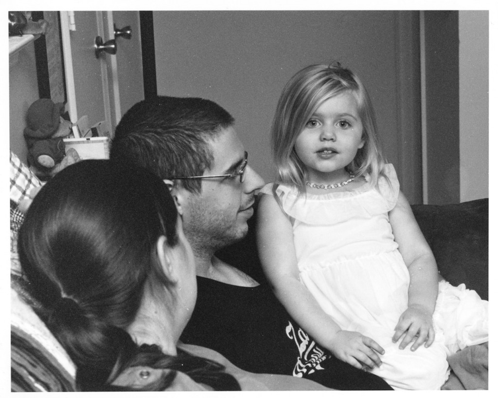
Final print - BW400CN negative

One of the three final prints I made. You’ll notice it needs spotting; the negative has a whole lot more crud on it than my regular B&W do, and the magnification level needed for this crop really didn’t help. That’s an easy fix, if somewhat time consuming.

I ran a quick test giving it 15 seconds of exposure instead of 14. That’s not a very big increase, but it did make a subtle improvement to the detail on the white dress. It had no noticeable effect on the shadows and an almost imperceptible darkening of the midtones. That’s close enough to what I wanted, so that’s the time I exposed the three final prints for.

When I do multiple prints, I’ll expose them all one after the other, storing the exposed paper in a left over lightproof bag from a used package of paper just to ensure they don’t accidentally get fogged. Then I run them sequentially through the trays.

In this case, the sequence was:

Print 1: 1 minute in developer, 30 seconds in stop, 1.5 minutes in fixer.

Leaving print 1 in the fixer, I start on print 2: again, 1 minute dev and 30 seconds stop. At this point, I move the first print out of the fixer (it’s been there 3 minutes by now) and into the water soak tray. Print 2 goes in the fixer for a minute and a half, and then I repeat the sequence with print number 3.

Once print 2 has joined 1 in the water tray, print 3 goes in the fix bath for 3 minutes, matching the first two. It then joins them in the soak tray.

At this point, I quickly return chemicals from the dev, stop and fix trays to their bottles and rinse out those 3 trays. I’ll be using them to wash the prints.

Washing is done with a print per tray, fill tray 1, then 2, then 3. Dump tray 1 and refill, do the same for #2 and #3. Repeat the sequence for 6 cycles of fill and dump, then hang the prints to dry. It sounds much worse than it is.

I am very happy with the result, though the prints do need spotting. My C41 is never, ever as clean as my traditional B&W negatives and there was a lot of magnification, so much so that were I to have printed the full frame instead of cropping, it would have needed 16×20 paper to fit. I’m impressed by the sharpness and grain considering that it’s 400 ISO film and was underexposed a stop or more to boot. The magnification does mean that any dirt or dust is that much more obvious, too. I’ll be examining how to deal with that problem in a near future post.

I’m not going to pass final judgement until I try a less-magnified enlargement from a properly exposed BW400CN negative, but on the strength of this result, I’ll certainly be taking that step at some point with some existing negatives which are worth a “fine” print.

That said, I wouldn’t ever choose to shoot BW400CN with the intent of enlarging it optically. This is by far the most grungy negative I’ve had to deal with, even though it was processed exceptionally well by a reputable pro lab; it’s the first print I’ve made where I knew I would have no choice but to spot every single print. Oh, joy. Gotta learn that skill, though, so now is as good a time as any. Also, it is a peerless pain in the ass to focus. Granted, the focus rails on my 23CII are in need of some TLC and could be smoother in operation, but this was orders of magnitude harder to properly focus than even the fine grain of Acros or Pan F+. It just doesn’t snap into focus the way traditional silver grains do.

There are just too many “gotchas” involved here to make it worth doing as a matter of routine.

Exploring film base consistency

Err, what?

When making contact sheets, you want to keep things consistent. Film base exposes to just shy of black on the paper and highlights fall wherever they will at grade 2. That informs you whether you blocked up shadows or not, and what might be a reasonable contrast grade to use for a fine print.

Yes, but…what?

The film base (or more accurately, base plus fog) represents the absolute lightest shade on the film. No exposed part of the film can be lighter, and consequently no part of the print can be darker than the film base.

So film base plus fog is important in making contact sheets. I really, really don’t want to have to run a test strip every time I make a contact sheet. This is not the “fun” part of darkroom work any more than making digital contact sheets was fun. It’s a necessary step, that’s all, and having to run a test strip every time just makes it even less fun (I have nothing against test strips, I enjoy that part of the printing decision-making process, picking my area of interest and wrestling the tones into place. It’s a challenge, unique to every negative and paper combination. Contact sheet test strips, on the other hand, are not a challenge. Expose expose expose expose develop which strip is most black? No artistic interpretation required. At all.)

Anyway, my point: if I can keep things as consistent as possible where the film is concerned, I can keep my contact sheets consistent without having to test constantly to find the right time. One exposure to rule them all, and in the darkroom, bind them.

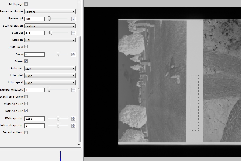
I love both Tri-X and Ilford HP5+. Visually, it has always seemed that while my HP5+ has very consistent base tone, my Tri-X can get a bit…variable. My process isn’t that wobbly. Really. Now I don’t have a fancy densitometer, but I do have a film scanner and Vuescan (which has an exposure lock feature intended to set exposure off the film base).

Ghetto Densitometer

Using VueScan to measure base+fog on a strip of film. Note the selection area and the “RGB Exposure” lock settings on the left side. All 5 rolls of HP5+ were within a couple of hundredths of this one. Tri-X varied more but not enough to warrant testing every time.

So I used what I had, like the resourceful little maker I am.

I found that the 5 rolls of HP5+ I tested were incredibly similar. This is despite their being developed at various temperatures in the 70-74F region, with times I was still trying to decide on. They were all fixed in Kodak Hardening fixer (not recommended BTW with HP5+ unless you enjoy reverse cupping, I guess Ilford recommend non-hardening fix for a reason!)

The Tri-X, by comparison, had much more variation, though still within a narrow enough range that I’d be OK using the same exposure time.