In part 1 I considered ways to use a standard LED light bulb in place of the PH140 and ended up with the Utilitech Pro from Lowes.
Part 2 saw me cobble together a vaguely alarming cardboard-and-hot-glue contraption to hold the bulb in the right place.
Finally I made some comparison exposures to test for differences. I expected to see longer exposure times as the PH140, an overdriven 75W incandescent, pumps out 1150 lumens compared to the Utilitech’s 60-watt equivalent 800 lumens. I hoped for equally good coverage. I knew I’d see a change in contrast but honestly had no idea what to expect there.
Coverage
Though it certainly looks good by eye, the only way to know for sure is to make an exposure of an empty negative holder using each light source and compare them. I aimed for a mid-to-light gray with no contrast filters, which turned out to be about twice as long for the LED, all other settings the same. I set up for 6×6 medium format as my 80mm is not necessarily designed to cover larger frames.
This is how it appears on paper, with both tests scanned together for a direct comparison:
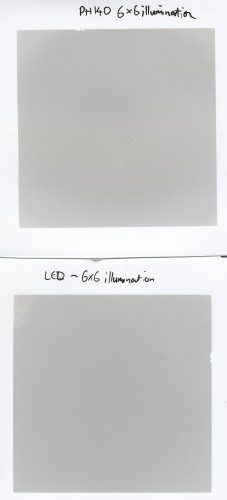
Not bad on either one; just a tiny amount of visible variation, if anything the LED looks a little more even! Ignore the blotch in the top left of the LED patch; that’s a thumbprint from slightly sloppy handling.
Next, some post-scan curves alchemy, slamming the white and black points toward each other so that the exposed patches are represented by the full available range of tones. If there was such a thing as grade 50 paper, it might look like this:
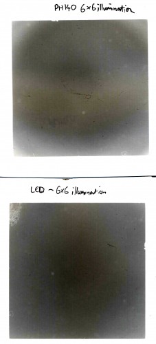
Blimey! So, the LED has a hot spot in the middle and falls off quite evenly toward the edges. Some of that might be down to the longer path taken by the light exposing the corners here; this was a 4×4 inch patch, the enlarger head nearly bottomed out, so I’d expect some falloff in the corners under the circumstances. The PH140’s light spread is weird and awful looking, with very sudden and severe drop off into the corners, though the center isn’t quite so hot as with the LED! LED for the win, folks.
Again, keep in mind that’s a highly exaggerated contrast level and that the first pair of patches are really what it looks like. In real prints even the PH140’s oddball coverage, which is just discernible in the unmolested scan, does not make any noticeable impact. So the LED? It’ll do just fine, thank you. I should probably be edge burning my prints anyway, which would only serve to cover up the slight loss of light in the corners.
Exposure and Contrast – Grade 2 filter
Next up, a comparison of the two light sources through a grade 2 Kodak Polycontrast filter. This will give me a feel for how exposure time and contrast selection would differ. Again, both prints were scanned together, so the tones on one compare directly to the other.
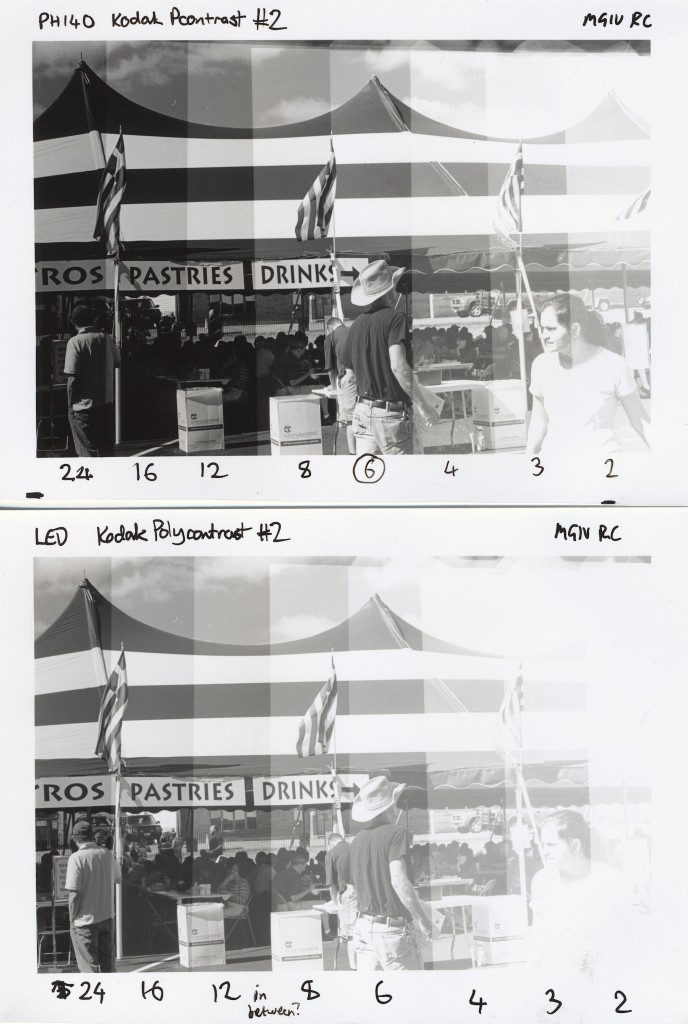
The differences are fairly clear: the LED needs longer print times and has considerably lowered contrast. The longer time is about what I expected. Looks like highlights start coming in about 2/3 of a stop slower than with the PH140, somewhere between 8 and 12 seconds for the LED vs 6 seconds for the PH140. Since I’m about to start using Adorama VC RC and the new Ilford FB Classic papers, both of which are faster than the Ilford MGIV, I could actually use that slight increase in times.
The massive change in contrast through the #2 filter is rather unexpected. Now, since I’m moving toward split grade printing using blue and green filters, this may not matter too much, but it’s an interesting data point. I haven’t formally tested unfiltered exposure, but did make a couple of contact sheets that way and they looked to have normal contrast.
My next move is to subject this setup to some real-world abuse by making prints. I’ll find out in a hurry if there are any significant shortcomings.